|
5.19.14 - 5.25.14 Hiya ! I was a little out of it this week, so this post won't be very long. After hitting the ground running when summer began, I guess momentum was lost and a sort of unplanned break was in order. Hopefully the upcoming week will be way more productive, though, as we have lots planned. :D There's nothing wrong with taking breaks every once in a while -- you don't want to end up burning yourself out ! Anyway, let's begin ! Last week we settled on the general colors for the player characters, but after meeting with Trent again, we made a few more changes. 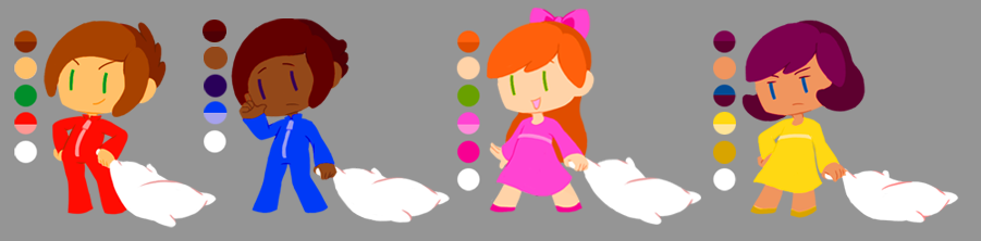
The changes are super small, such as changing hues or values slightly, but I wanted to document them anyway !
That's about all that was done on the players this week ! What's next are more spoilers, so be warned ! **Twoneironauts Spoilers Ahead**Hooray, here's some more concept work on Nyx, continuing from last week ! I've been working on her for another class, ART401, where we had to do a character design. Our professor wanted us to work on two of the designs we made last week, I went with #3 and #5, since the team (and I !) liked them the most. We were talking about how she could have more than one form, so that's how I treated these thumbnails. 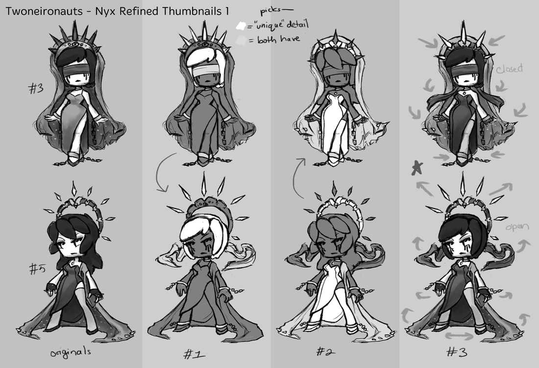
Since she would be "evolving," so to speak, I wanted the two designs to be more similar; to "flow" into each other. The original designs already had a headpiece, a slit dress, slipper shoes and a long cloth accessory, so iterating on them wasn't as difficult as it could have been if I'd gone with the other designs. For #1 and #2, I took aspects from the first design and worked them into the second one, respectively. But there were also aspects that I used in both regardless, such as the running mascara/ink/blood, the blindfold, and the shackles. After that, I picked the aspects of both comps that I liked best, as shown in my "value" key. Most choices, like the headpiece spikes and the hair style, had to do with the silhouette that was created. #2's hairstyle was unclear with the blindfold, so I wanted to prevent any silhouette confusion. The other choices were mostly surface detail things at this point, like the lines on the dress, for example. #3 was just putting all of the chosen aspects together. While doing these comps, I found that the two forms were opposite of each other -- #1 was covered, closed, possibly protected, while #2 was revealed, open, and strong. I just thought it made for fun contrast in the designs ! After coming up with Nyx's "final" designs, I made some clean line art of them: 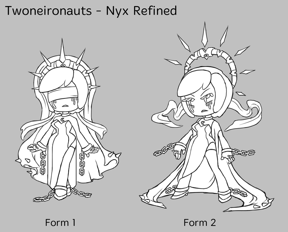
NOTE: The designs will probably not be this detailed in the game, since the style we're going for will be lineless. I then did a few value comps ! 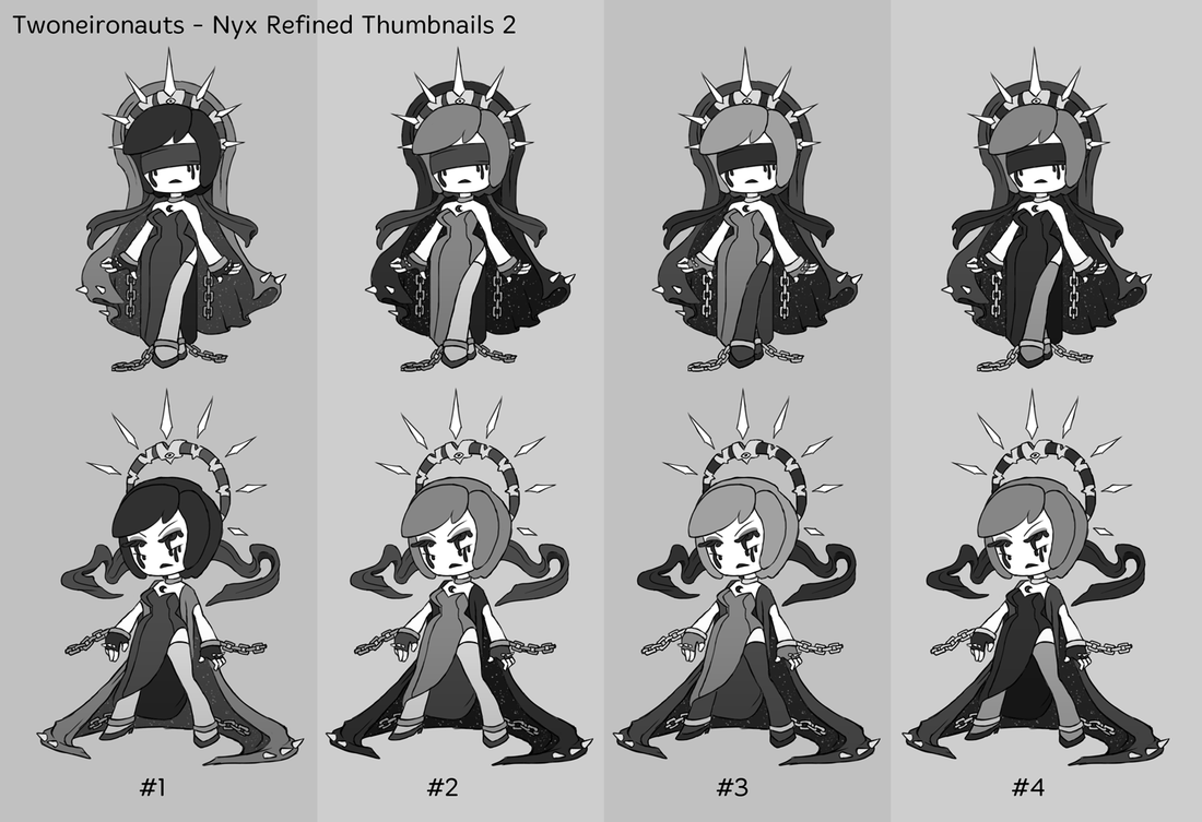
A few aspects I wanted to keep in tact for these comps were:
The third bullet was the most difficult to keep track of, especially as the comps went on. Contrast/values in general is tricky, but using it to have certain things pop more than others is important ! I personally like #1 and #2, since they're the easiest to read in terms of value, but I'll be meeting with my team and will see what they think. I'll be working on her again this week, so stay tuned ! I hope you've enjoyed this shorter post. As always, feel free to leave questions or comments. :)
0 Comments
Leave a Reply. |
Archives
April 2015
Tags
All
Production BlogPosts by our team members. |
 RSS Feed
