|
5.12.14 - 5.18.14 Hey there, Liz again ! This post is a bit late, so I apologize. Anyway, this week was focused primarily on nailing down the player's designs -- introducing color, at least -- along with beginning to concept a new character ! :D Since a lot of it was iteration, it'll be a bunch of variations of the same images. Just a heads up before we start ! Although last week ended in the style going towards one similar to The Legend of Zelda: The Wind Waker, due to suggestions from the team, after getting feedback from the professors, I decided that the other style would be more fitting. Although I liked the other style, I felt that this one was simpler and fit more for the game. So I took the thumbs and cleaned them up to make comps for the characters: 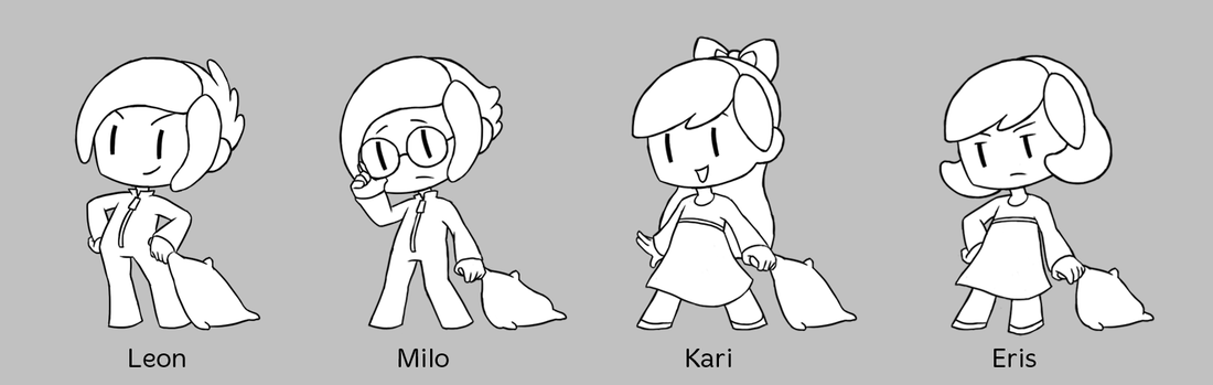
I also put their names, which I guess I haven't mentioned yet in my posts ! Leon, the athlete/leader; Milo, the smart/nerdy one; Kari, happy/bubbly; and Eris, the cold/distant one. These are the names and personalities planned for the characters right now, but are subject to change, of course. After meeting with Trent, he had some crit -- namely for the pillows. He pointed out how they're small; too small for the characters to lay their heads on, which was completely true ! I honestly hadn't taken that into consideration at all, so after working with him to figure out proper sizes, we ended up with these comps: 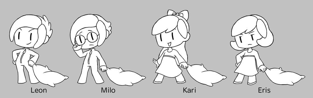
It's funny because it turned out that their heads are so big, the size of their pillows are about the size of their bodies ! But these pillows look better and make way more sense, so I'm glad he pointed their size out. It was also a good reminder to me again to take everything into consideration, as scale as been an issue for me, it seems. After getting those comps done, I started tackling color !! Note: This first set of color comps was made before Trent had pointed out the pillows to me, so they're all holding the smaller pillows. Since Twoneironauts is a sequel, we had "set" colors for all of the characters already. I took the original colors and did variations of them, since we'd already made it clear that we weren't going to completely stick to the previous game's designs, etc. like gospel. The four comps I did for the first set were: upping the saturation and adjusting some hues, trying to make a triad color palette of the newly saturated palettes, shifting the colors towards "cooler" hues, and then shifting the colors towards "warmer" hues. 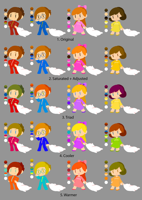
For more explanation: 1. Original: The original character palettes from Oneironauts ! With some minor adjustments in hue. 2. Saturated + Adjusted: Pretty self explanatory, aha. For Twoneironauts, we decided that our characters' colors would be way more saturated than the backgrounds', so that they "pop" against it and are seen better. I also did some hue shifts in the players' hair and color changes as suggested by Peter Moerhle, such as the zippers on the boys' onesies. 3. Triad: For these I tried applying some color theory, aha. I chose triad instead of complimentary to make it more interesting; a sort of "rule" I try to keep in mind when choosing colors for characters. Which is basically having two main colors and then a third (beauty spot) color, which I use for details or focal points -- which happen to be the eyes in these guys. I eventually ran into trouble with this with the complementary main colors -- since there were four characters, two of them had to share one complementary pair, which turned out to be Kari and Eris. To deal with this I pushed Kari's colors cooler and Eris' warmer, but I didn't like that each character didn't have their own colors, so to speak. I still liked how these colors turned out, though, especially Eris' ! 4. Cooler: I took the Triad color palettes and played around with the colors, shifting them towards "cooler" hues. ex. Purplish-red for Leon's onesie. Kari's hair color turned out to be a bit too light against her skin though. 5. Warmer: Here I did the opposite and shifted the Triad colors warmer, which created a strange sort of neon/pastel color palette. Although I liked these, mostly because they so were different, I knew we wouldn't be using them for the game. When meeting with Trent, as previously mentioned, we decided that a good fallback would be using the Saturated + Adjusted color palettes, and then picked what we thought were the best palettes for each individual character -- along with making minor adjustments, such as Eris' skin color, which I thought worked really well. 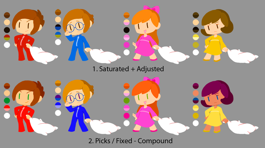
When trying to integrate our favorite picks with one another, I tried applying some color theory again, this time going with a compound color scheme. A lot of it was eye color changes, which worked out as I wanted to keep the "two main colors, one beauty spot color" rule. After placing the new comps on the team Dropbox (which can be found on the Document page), someone suggested changing Milo's skin color -- so the next few comps will be tackling that aspect of the characters ! 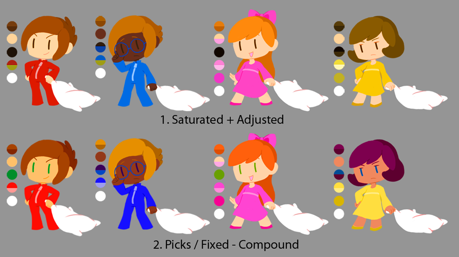
I first changed Milo's skin color in both "chosen" color palettes, but after changing Leon's skin tone a bit in #2 as well, I decided we would be moving forward with that one. In the first pass I kept the original hair color, when someone suggested different hair comps afterwards. So I did a few hair color comps for Milo in the following: 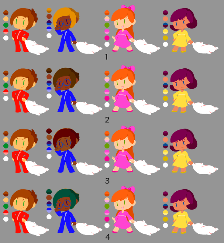
I liked the original blonde hair because it was different, but I was also concerned that because it was so different that it might make him stick out. So I went with more "natural" darker hair colors in these comps. We felt that #3's reddish hair color worked best, but I'm still a bit concerned that it may blend with Eris' hair. I'm sure there will be more iterations to come, though, so the following image is our color palette for now ! 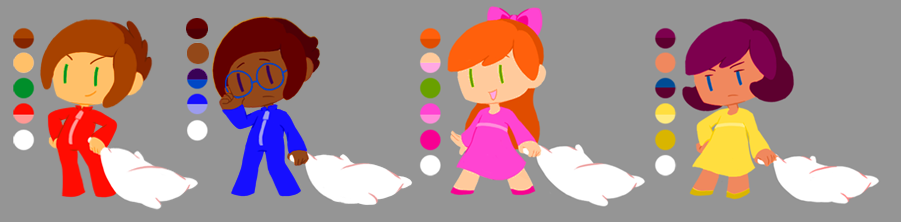
Having a variety in all of the characters is nice, and something I wanted when starting to redesign the characters. I just didn't want to stray too far from the first game, but I need to remember that we don't have to stick to those designs !! I then did some rough turnarounds of all the player characters, something we'll have to start thinking about ! Figuring out how the characters' hair worked in 3D, if you will, was difficult since they're made of such simple shapes, so I'm glad I got to start thinking about it with the turnarounds. Kari's bow is another thing to think about, as I'd like it to tie some of her hair up, but the bow itself is a bit too high up for it... Little things to contemplate ! So up next contains Twoneironauts spoilers, but is something that I'm super excited about !!!! **Twoneironauts Spoilers Ahead**This week I started concepting Nyx !!!! The main antagonist/final boss for the game. :D You can read a bit more about her on the Reference page or Story Doc (on the Documents page), if you're interested. For Nyx, I started concepting her in a different way than I usually do when concepting characters. At GDC I was able to receive a portfolio review from Bo Lu, a concept artist at Riot Games, and he had some awesome advice. One thing I learned was that when concepting new champions, they think of what the characters' attacks/moves will be, and concept around that. Since her attacks haven't been solidified yet, I decided to go that route when concepting her, along with trying to push in some personality, something that I have trouble with. 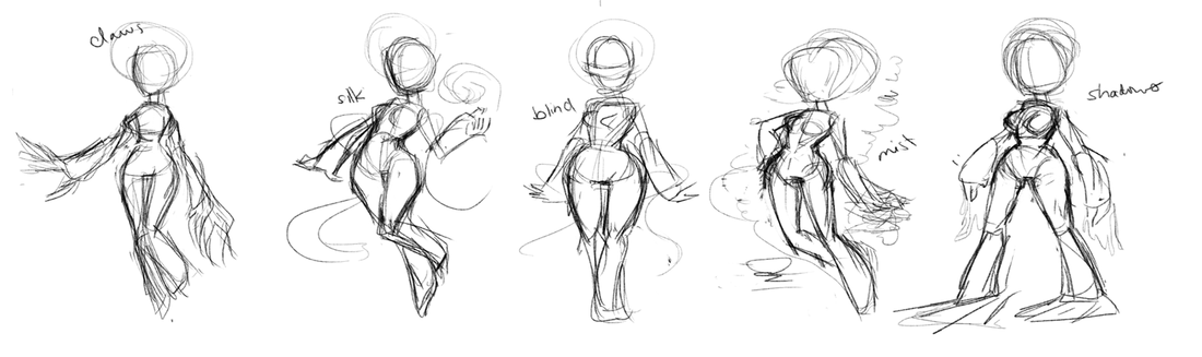
So these are the sketches I started out with, haha. Really just concentrated on body types and attacks/moves/character aspects, since clothes/hair were just details (though still important, of course). The attacks/aspects I first thought of were claws, manipulating silk (as she's usually depicted wearing it), being blind, a dark mist attack, and manipulating shadows. A reference when doing these was Skullgirls !! We originally wanted to do hand-drawn animation like Skullgirls, but we don't have the time nor manpower to do so... It's still an inspiration for me, though ! I uploaded the sketches as a WIP on DropBox when Trent mentioned playing around with Nyx's size in relation to the characters. Another scale thing, ah ! He mentioned trying to make her 1 1/2 - 1 1/3 around the characters height, which you can see here: 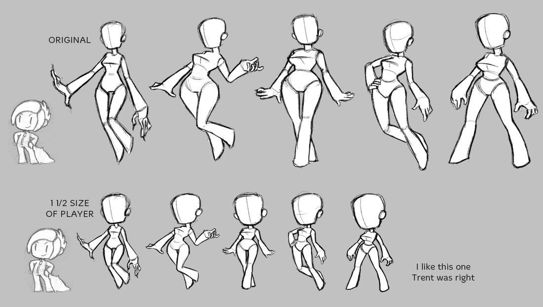
These are more cleaned up, in terms of the body at least, but as you can see -- Trent was right. :P It was strange keeping the same shapes/styles as the player's with Nyx's proportions, but I think it turned out all right ! Next was adding/extrapolating the details (clothes, hair, etc.) based off of my sketches/ideas. I also threw on some value! 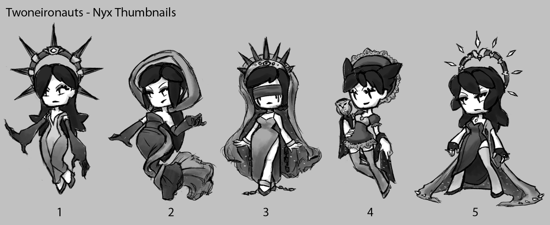
Although some of the ideas may have changed (such as #4), a few things that I wanted to keep across all of the thumbnails/designs were:
To match the player characters and overall theme of the game, I also referenced fancier nightgowns for her outfits, although I'm sure they can be mistaken as just dresses. I just know I didn't want to draw her in Greek dresses. Even though Greek mythology is a huge reference for the game, I felt that it would look out of place, since everything else is expected to be a bit more modern. I'll also mention a few things about each thumbnail in terms of each individual design !
So that's about it ! I hope you're enjoyed this character-centric post. As always, feel free to comment or ask any questions. :)
0 Comments
Leave a Reply. |
Archives
April 2015
Tags
All
Production BlogPosts by our team members. |


 RSS Feed
