|
Liz here again ! Here to talk about what I've done this week, which is like the title says, thumbnails and beat boards ! ART399 has started, so now instead of just having tasks from the team to do for Twoneironauts, I have homework to do for the game as well ! They've been pretty similar to what we were planning on doing anyway, so it'll be really helpful. There's some WIPs in here, so I'll have some more explaining to do in terms of my process. Let's go ! One question asked during feedback last week was "How big will the characters be on the screen?," along with the suggestion of creating silhouettes to that size to see how they read. So one of the first things I tackled was getting a definite answer to that question. I asked Trent, who said that they'd be around 25 - 35% smaller than they were in the mock ups, so I adjusted them accordingly, as seen below: 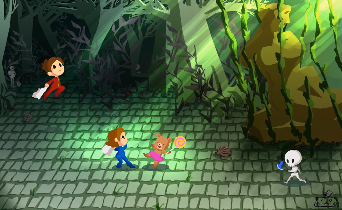
The second thing I tackled was the feedback of exploring styles for the characters, keeping in mind that I didn't have to be constrained to the original Oneironauts style. Using the first boy for these thumbnails, I tried exploring different proportions, shapes and styles we could possibly go with. These can be seen in the first image. While working on these thumbnails I looked at other games, mostly for proportion reference, such as Animal Crossing, Castle Crashers, and Shantae: Half-Genie Hero. Reference is always helpful and inspiring to use, so don't forget to use it !! As I mentioned, I tried playing around with shapes in these thumbnails, especially with the limbs and hands/feet. Another piece of feedback I tried to incorporate was possibly making the hands and feet bigger, since the characters would be so small. Along with using them to break up the monotony of similar-sized shapes and flow of the silhouette, adding some contrast. I then made silhouettes of the thumbnails in the size we decided the characters would be on screen, which can be seen in the second image. Being aware of the negative spaces you create around and within silhouettes are important as well when designing, so it's something else to keep in mind ! After creating that set of thumbnails, I handed them over to Trent who sent out team feedback forms for them (and has been each time we wanted feedback !), asking what style(s) members liked, why they liked it or why they didn't like it/how to improve it. Members gave their feedback pretty quickly and I whipped up these thumbnails in response: The top three styles I saw in the feedback were the original style, #5, and one that wasn't even in the first set of thumbnails, but was mentioned a few times by members in feedback -- the proportions in The Legend of Zelda: The Wind Waker. Members gave this specific game along with ample references, so it wasn't something I wanted to disregard. With these three styles in mind, I decided to draw all four characters this time, along with applying some of their personalities to their poses. A quick breakdown of what Trent has in mind for the characters' personalities are: athletic/leader, smart/nerdy, happy/bubbly, and cold/distant, from left to right, respectively. I tried to keep this in mind when giving each one their respective pose, wanting to make each of them distinct from one other. I then gave them the silhouette treatment as I did before, making them the size they'll be on screen. Some silhouettes read better than others, as you can see. Another feedback form was then sent out, and the majority was in favor of style #2 ! So I took those thumbs and did some eye/face thumbnails, another thing that was pointed out in feedback last week. I really tried having a big variety of eye styles in this batch, even if I knew that we just wouldn't go with some. Messing around with the shapes was fun as well -- going from dots to super big eyes, just to see what it would look like. It was also interesting to see how the eyes would look on each character; for example, they could work on one character but look wonky on another. A lot of experimentation in this batch ! References I used for these came from all over the place, such as Panty & Stocking with Garterbelt, Sailor Moon, and Cherry from Studio Killers. The last thumbnails I did this week were revisiting the different pajamas that I thumbnailed previously, removing some of the options members didn't like as much and adding a new one -- pajamas based off of the frog enemy in the game ! I also made screen size silhouettes of the pajamas to see what they look like. Some read well, but some are rather plain and unrecognizable without the surface detail, which is something I'd like to prevent. So there will definitely be more iterations in the future ! Whee, time for the beat boards ! Since we have gameplay already figured out for Twoneironauts, we decided to use them to do first passes at some cutscenes in our game. Trent's been developing the story so I worked with him to create these -- explaining why there are some WIPs ! I'd also like to give a spoiler warning as some of these cutscenes are further into the game. Be warned ! The first cutscene I beat boarded is the opening of the game: The only real WIP in here is the sketch I did before cleaning it up, so I don't have too much to say. I tried having varying shots and angles, but tried to lead the eye from one frame to the next as well -- something to consider when doing boards. Having a variety of foreground/middleground/background elements is important as well, as it helps create depth within the scene, preventing it from being flat and uninteresting. I also tried to differentiate the characters from one another with small details, such as the hair bow and glasses. Although this is a first pass, I wanted to plan out where the characters would be, along with figuring out their poses/how they would act. A fun reference I used in creating these beat boards was Cardcaptor Sakura, specifically in the third panel. I thought that the sequence in the beginning where she loses all of the Clow Cards was perfect. **Twoneironauts Spoilers Ahead**Spoiler time ! The second cutscene I beat boarded was the series of final hits before defeating the game's final boss, Nyx, inspired by Mercenary King's intro (warning: gore). There are a few WIPs that include some other reference I used. We wanted these frames to really match the character's personalities, and have them be a nice wrap up of the final battle. Nyx hasn't been designed yet, so she's just a shadowy figure for now ! As for the characters, I thought about how they would swing their pillow, based on their traits. For the athletic/leader character, I thought that something sports-related was best -- so baseball immediately came to mind ! For the smart/nerdy character, I thought he would be calculated in his actions, which apparently translated to tennis players for me. Happy/bubbly became a bit "happy violent," as I thought of Harley Quinn, but I also thought that the pose worked well as reference. Cold/distant was tricky for me, but I turned to Stocking, who looks cold to me, but I could be completely wrong as I haven't watched PSWG yet, haha. Anyway, after the first pass Trent looked over it and gave some awesome feedback ! He suggested rearranging the characters' angle when hitting Nyx, which ended up really helping the flow of the eye in the frames. He also helped with the trouble I was having with the characters, especially happy/bubbly and cold/distant. In his mind,happy/bubbly was more reluctant to hit her foes and had a top-down swing, rather than the side. Then cold/distant was (as my notes say) a jerk who enjoyed hitting her foes, and her hit was more of a hard upswing, giving Nyx a sort of uppercut. I applied his feedback, which really helped establish more of the characters' personalities. I then cleaned the boards up a bit. I also had two versions of the action lines, and Trent liked version 1 as it was more direct in telling where the hit was coming from. The last cutscene I boarded was the game's end scene. The only real change from the WIP was propping the book up, but I'm not completely sure about the values/composition in these boards. I really want the end to be visually strong, so I'm looking forward to my professors' feedback !!
So that's about it for this week ! Once I get team feedback for the eyes/face thumbs, I'll update this post. If you have any questions, feel free to ask, as I know some of my advice blurbs can be pretty vague sometimes. :) Professor Feedback for the art in this post can be found here.
0 Comments
Leave a Reply. |
Archives
April 2015
Tags
All
Production BlogPosts by our team members. |


 RSS Feed
