|
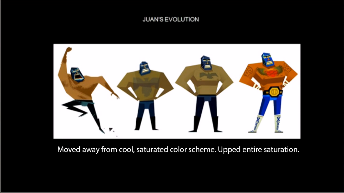
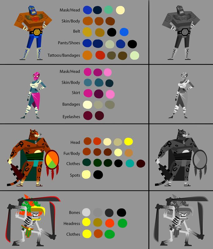
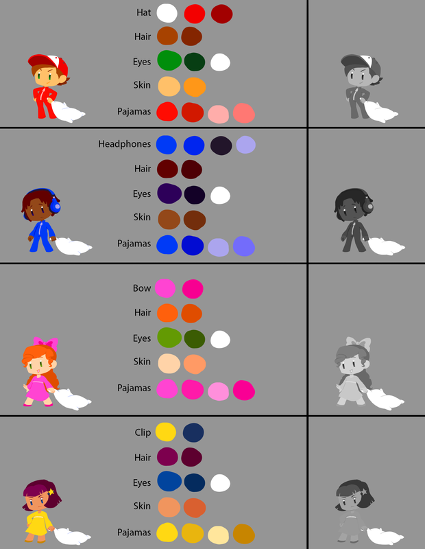
Liz here again ! In this post I broke down some of Guacamelee and the current Twoneironauts' characters to see what they did, what we are doing, and to learn from it all. Juan DevelopmentIn the Art of Making Guacamelee, which can be seen here on the GDC Vault, Drinkbox Studio's Concept Artist/Animator Augusto Quijano speaks about Juan's concept development. TL;DR on color development: At first, the environments were colorful and full of high contrast, while the characters were desaturated. This became a problem though, as they found that it made the characters hard to read, being made up of middle gray/muddy colors. So they moved away from the light on dark backgrounds and desaturated it, making the characters the most saturated instead to help follow combat. 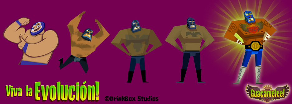 TL;DR on shape/style development: Concepts started out with round and friendly shapes, since the team was finishing up their first game, About a Blob. This didn't match the style or audience they were going for with Guacamelee though, so they reevaluated the style and started using edgy, jagged lines, and angles instead. Colors
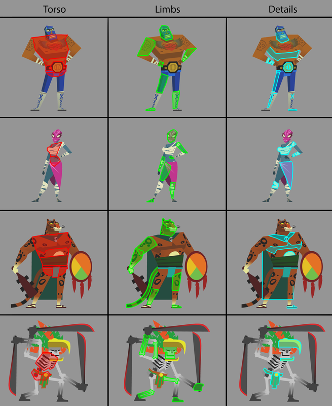
Shapes
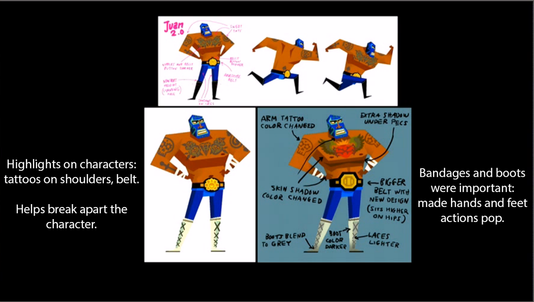
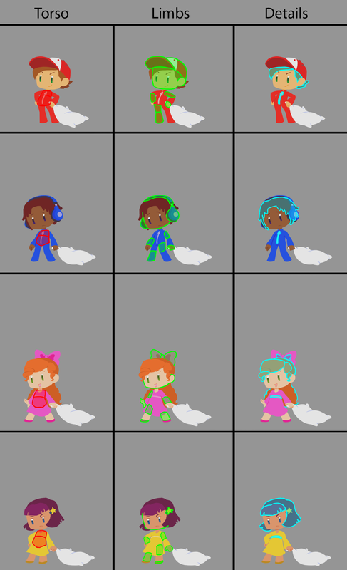
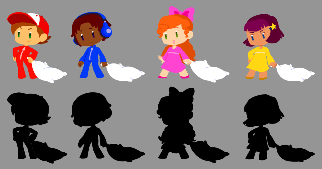
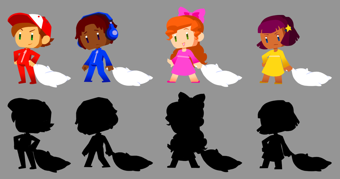
PaintoverI did a quick paintover of the most current designs for the Player characters. To move more towards Guacamelee's character style direction, the biggest "changes" that need to happen are:
• Applying gradients and shadows to make certain areas (such as hands and feet) pop or break them apart. • Possibly adding another highlight color or using more of the tertiary "eye" color on the characters, to add more interest and help break things apart further. • Using strong and graphic shapes for everything. Possibly simplifying hands and adding actual feet. These designs still need more work done, since the colors and shapes don't feel as good yet. I also put them in the paintover of the Sunken Forest to see how they look. I do think they read better now, which is helped by the gradients and shadows.
0 Comments
Leave a Reply. |
Archives
April 2015
Tags
All
Production BlogPosts by our team members. |

 RSS Feed
